Tuesday, 30 September 2014

Film Proposal

Adam Barlow- 30th September 2014

Proposal for Creative Media Production Project

Format and Medium: My film poster will be created on an A4 piece of paper but it will be high resolution so if it gets scaled up for a newspaper or billboard you will be able to see it better. I will also create a DVD sleeve, which will be 27” by 39”.

Sector: I will use my film poster in the film market on billboards, magazines and newspapers.  My DVD sleeve will be used on a film cover within shops.

Name of my film: The Killing will be the name of the film.

Genre: Horror/Thriller Genre.

Intended Audience: The audience for my film poster will be people who are into horror/thriller films. The age rating will be for 15.

Summary of the storyline:  The Killing, a story of a young family that makes a horrifying discovery that innocent daughter is not as innocent as they think. With their new home being an abandoned Victorian house and mysterious acts happening throughout the day, who will the family turn to?

Summary of style: The overall layout of the film poster will follow a stereotypical horror poster with the possessed girl standing at the front with the abandoned house behind her. This will give out a scary vibe due to the girl looking mentally ill. The DVD sleeve will follow the same idea as my film poster but with more information about the film such as a small summery of the film , producer/actors names and other snip its of information. The film poster will not have as much information on it due to people not having the time to stand and read every single bit of the information presented. I will used red, black, white and grey in my poster. I will make the eyes on the girl red to make it represent the genre. The body language of the girl will be stood up straight with her arms by her side. The facial expression will be serious and straight faced.

Legal and Ethical Considerations: In doing my film poster and DVD sleeve I will have to take into consideration about the BBFC age restrictions, defamation, copyright and ASA codes. I will be adding an age restriction of 15 to unsure no one younger than this age will be able to watch/buy my product. I will take defamation into consideration ensuring that if I use any pictures of people, I will not write anything bad about them. To not break any laws of copyright, all the stuff on my poster and DVD sleeve will be all produced by me with no logos or producers names of other films being used. My film poster and DVD sleeve will not be falsely advertised and will be legal to follow the ASA codes.

Skin Tutorial


Before 

This is the orginal imaged I used. As you can see she has oily skin, spots, pimples and freckles. I used Photoshop to do this.


After
I used the spot healing tool to get rid of her spots, pimples and freckles. I duplicated the layer and added a blur smart filter over her face. I then added a layer mask over this. Last I used a paint brush tool to un-blur certain features such as her eyes, hair and lips. It made it look fake and waxy. This shows how models in the media industries can be perfected through photoshop to hide things such as spots and freckles.


Using these tools, it shows how people in the media industry are falsely shown to look better than what they actually are.


These are the tools I used.

Keying Out Backgrounds With Green-Screen

To key out the green-screen behind the thing you want to cut out, you first have to go onto select and click on 'colour range'.


 After doing this, the colour range box will appear on your screen. Click onto the sections that you do not want anymore. Press okay when you are happy with what it looks like.
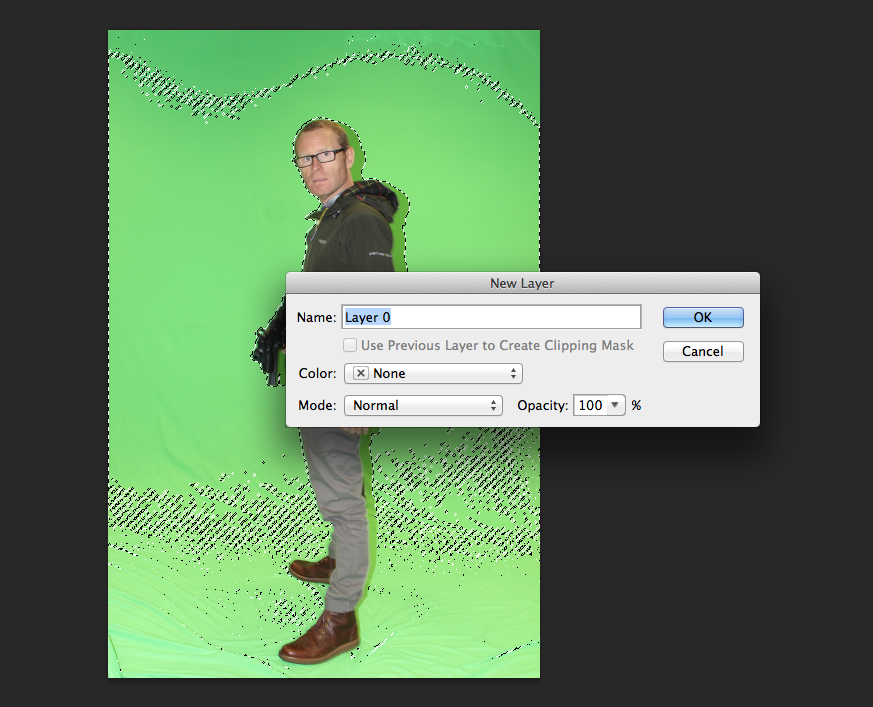
Double click on the layer that it is on and a box will come up. Press ok. When you have selected all of the parts you do not want, a line will appear around it all and press delete.
The last step after you have deleted the green-screen is to deselect the image. This is how you get rid of the green screen. If you have green parts still left, you can use the rubber tool to rub them out.

Wednesday, 24 September 2014

Whats In a Poster


I created a mind map of all the things that you would find on a film poster. For example, the headline which would be in a bold font to stand out.

Thursday, 18 September 2014

Illustrator Graphic Piece

The image I used is a bitmap image which means that when you zoom, the image is pixelated and is harder to make out what the image is of. Whereas a vector image is the opposite, so when you zoom into the image, you never see the pixels however far you zoom in.


I took an original picture of myself which I started to create a cartoon copy of it using Illustrator. One of the main tools I used in the process was the pen tool. With this tool I could start to draw the outline of my face by clicking around the outline which would leave small dots around the outside, I could then change them to be more curved to fit the outline of my face better. After creating the outline of my face I then chose a colour which would match the colour of my face on the original picture. I used the eyedropper tool to get the correct colour. I could click on my face on my original picture with the eyedropper tool and then click on the outline of my face to get the exact colour I want. I then went onto doing an outline of the rest of my facial features, following the same steps as when I created my face. With the use of layers, I created each facial feature on different layer so if I wanted to add more detail to something, I could hide the parts I don't want. Another thing I could do with the use of layers was that I could lock the ones I wanted, by doing this I could prevent certain things from moving out of place. Another tool I used in the process was the direct selection tool. With this tool I could pick up certain points that I wanted to change, instead of having to redo the whole outline again. I could also zoom in and out on the image so it would make it easier to draw an outline around the image.