Wednesday, 26 November 2014

File Format Research (Edited)

In a previous blog, I posted all the different file formats that I will use and also information about each of them. As I didn't need all of the information, I highlighted the key pieces that I think people need to know about. I rewrote it into my own words to simplify it for people who are new to these key file formats. This is what I simplified each file format to.
JPG (Joint Photographic Expert Group)
A JPEG in computing is most commonly used as a method of lossy compression in digital images. This is mostly for images, which are produced by digital photography.  JPEG compression is used in many image file formats. In digital cameras and other photographic devices, JPEG is the most common format used.

TIFF (Tagged File Format Image)
TIFF is a computer file format that can store raster graphic images.  The file format TIFF is supported by image manipulation. It is done by publishing page layout applications along with scanning, faxing and word processing.

PNG (Portable Network Graphic)
Portable Network Graphics (PNG) is a raster graphic file that supports lossless data compression.  PNG is just like a GIF.  It was designed for transferring images on the Internet for better quality images.

BMP ( Bitmap Image File)
The file format BMP is also known as a Bitmap Image File or sometimes just a Bitmap. This is a raster graphic image file format that is used to store digital images. It is also capable to store 2D digital images.

PSD (Photoshop Document)
A PSD is a layered image file that is used in Adobe Photoshop as a raster graphic. This stands for Photoshop Document and is the default format when saving in Photoshop.
 AI (Adobe Illustrator Artwork)

Adobe Illustrator Artwork (AI) is a file extension for vector graphic file formats in Adobe Illustrator.  It can contain both vector and bitmap graphics within this.
 WMF (Windows Meta File)

Windows Metafile (WMF) is an image file format that is designed for Microsoft Windows applications. It can contain both vector graphics and bitmap components. The WMF is a file extension for a graphic file.

Tuesday, 25 November 2014

File Format Research (Not Edited)

I needed to search file formats that a designer is most likely to use. I needed to find the common formats about each of these file formats. I searched each of the most common ones and this is the information it gave me. I will later print this out and highlight the most important parts that I will use in my magazine article.

JPG
In computing, JPEG (// jay-peg)[1] (seen most often with the .jpg or .jpeg filename extension) is a commonly used method of lossy compression for digital images, particularly for those images produced by digital photography. The degree of compression can be adjusted, allowing a selectable tradeoff between storage size and image quality. JPEG typically achieves 10:1 compression with little perceptible loss in image quality.
JPEG compression is used in a number of image file formats. JPEG/Exif is the most common image format used by digital cameras and other photographic image capture devices; along with JPEG/JFIF, it is the most common format for storing and transmitting photographic images on the World Wide Web. 

TIFF
TIFF is a computer file format for storing raster graphics images, popular among graphic artists, the publishing industry and both amateur and professional photographers in general. The format was originally created by the company Aldus for use in desktop publishing. When Adobe Systems acquired Aldus, they published Version 6 (1993) of the TIFF specification which dropped the Microsoft reference.[2] TIFF remains a published specification under the control of Adobe Systems.
The TIFF format is widely supported by image-manipulation applications, by publishing and page layout applications, and by scanning, faxing, word processing, optical character recognition and other applications.

PNG
Portable Network Graphics (PNG), is a raster graphics file format that supports lossless data compression. PNG was created as an improved, non-patented replacement for Graphics Interchange Format (GIF), and is the most used lossless image compression format on the Internet.
PNG supports palette-based images (with palettes of 24-bit RGB or 32-bit RGBA colors), grayscale images (with or without alpha channel), and full-color non-palette-based RGB images (with or without alpha channel). PNG was designed for transferring images on the Internet, not for professional-quality print graphics, and therefore does not support non-RGB color spaces such as CMYK.
PNG files nearly always use file extension PNG or png and are assigned MIME media type image/png. PNG was approved for this use by the Internet Engineering Steering Group on 14 October 1996,[5] and was published as an ISO/IEC standard in 2004.[1]

BMP
The BMP file format, also known as bitmap image file or device independent bitmap (DIB) file format or simply a bitmap, is a raster graphics image file format used to store bitmap digital images, independently of the display device (such as a graphics adapter), especially on Microsoft Windows and OS/2[3] operating systems.
The BMP file format is capable of storing 2D digital images of arbitrary width, height, and resolution, both monochrome and color, in various color depths, and optionally with data compression, alpha channels, and color profiles. The Windows Metafile (WMF) specification covers the BMP file format. Among others wingdi.h defines BMP constants and structures.

PSD
Adobe Photoshop is a raster graphics editor developed and published by Adobe Systems for Windows and OS X.
Photoshop was created in 1988 by Thomas and John Knoll. Since then, it has become the de facto industry standard in raster graphics editing, such that the terms "photoshopping" and "photoshop contest" were born. It can edit and compose raster images in multiple layers and supports masks, alpha compositing and several color models including RGB, CMYK, Lab color space (with capital L), spot color and duotone. Photoshop has vast support for graphic file formats but also uses its own PSD and PSB file formats which support all the aforementioned features. In addition to raster graphics, it has limited abilities to edit or render text, vector graphics (especially through clipping path), 3D graphics and video. Photoshop's featureset can be expanded by Photoshop plug-ins, programs developed and distributed independently of Photoshop that can run inside it and offer new or enhanced features.

AI
Adobe Illustrator Artwork (AI) is a proprietary file format developed by Adobe Systems for representing single-page vector-based drawings in either the EPS or PDF formats. The .ai filename extension is used by Adobe Illustrator.
The AI file format was originally a native format called PGF. PDF compatibility is achieved by embedding a complete copy of the PGF data within the saved PDF format file. This format is not related to .pgf using the same name Progressive Graphics Format.[1]

WMF
Windows Metafile (WMF) is an image file format originally designed for Microsoft Windows in the 1990s. Windows Metafiles are intended to be portable between applications and may contain both vector graphics and bitmap components. It acts in a similar manner to SVG files.
Essentially, a WMF file stores a list of function calls that have to be issued to the Windows Graphics Device Interface (GDI) layer to display an image on screen. Since some GDI functions accept pointers to callback functions for error handling, a WMF file may erroneously include executable code.[2]


Monday, 24 November 2014

Magazine Proposal

Proposal for Creative Media Production Project

Format and Medium: My magazine article will be created on an A4 piece of paper due to the magazine being this size.

Sector: My magazine article will appear in media magazines in shops for people to go and buy.

Name of my magazine article: Graphic File Formats And Applications

Intended Audience: The audience for my film poster will be from teenage students to adults. I think the intended audience will be more adults who don’t know very well how to use programs such as Photoshop and Illustrator.

Summary of the magazine:  In my magazine articles, It has parts on how to create graphics in both Photoshop and Illustrator with images to show the stages. It will also have file formats and what they are used for.

Summary of style: The overall style of my magazine article will be 3 columns with text in them the entire tutorial. I will also add images of the stages what I went through in these columns with text underneath them explaining what they are. In black filled boxes, I will have the tools that I have used in these applications and another box with all my research on file formats.


Legal and Ethical Considerations: In doing my magazine article I will have to take into consideration about the BBFC age restrictions, defamation, copyright and ASA codes. I will be adding an age restriction of 15 to unsure no one younger than this age will be able to watch/buy my product. I will take defamation into consideration ensuring that if I use any pictures of people, I will not write anything bad about them. To not break any laws of copyright, all the stuff on my poster and DVD sleeve will be all produced by me with no logos or producers names of other films being used. My film poster and DVD sleeve will not be falsely advertised and will be legal to follow the ASA codes. As I will be adding pictures in of my film poster and DVD sleeve, I will have to take all this into consideration even though they are only screenshots of them in my article. I will put all of the images I have used in an image asset list, looking at the copyright status and ensuring that I can use them.

Thursday, 20 November 2014

Graphics Evaluation

Skills acquisition
In order to start to make my film poster and DVD sleeve, I first needed to build up my Adobe application skills. I created a cartoon portrait of myself using Illustrator to start to build up my skills. In the process of creating this portrait, I had to firstly take a picture of myself and then use the pen tool to start tracing around certain parts of my face. I have showed the stages and the tools I used on my blog. I also created a ‘perfect’ model in Photoshop. Within this skin tutorial, I used tools such as the spot-healing tool to remove spots, freckles and blemishes on the females face. The stages that I went through while creating this ‘perfect’ model can be seen by referring to my blog. I created my Expendables poster also in Photoshop. I did this as it will give me practice when I start to create my film poster and DVD sleeve as I can use some of these transferable skills. I used green-screen elimination to remove the background from the individuals who will be on the front of my Expendables poster. With things such as the background, BBFC logo and the main characters I had to move and scale them to how I wanted them to be. I recorded then stages I went through and posted them on a blog with an explanation of what I did. One of the last things that I did before starting to create my film poster and DVD sleeve was looking at photography. When taking the pictures, I had to keep in mind what my genre for my film poster and DVD sleeve was. As my genre was horror/thriller, the lighting in the studio was rather important. With having only one light shining on half of the face, it created a shadowy effect and linked well in with my genre. I used all of the transferable skills from creating things in Photoshop and Illustrator and these will help me when creating my designs in Photoshop.

Research and ideas stage
In the research and idea stages I studied the codes and conventions of both film posters and DVD sleeves. This meant looking at the format and genre of film posters and DVD sleeves but also the genre works. I looked at what is in a film poster to give me a better understanding of what should be in mine when it comes to creating it. I created a mind map of all the codes and conventions in a film poster, for example layout, images, headline. This can be referred to by looking on my blog where I inserted an image of my mind map with a small summery of what it is.

I started to explore different fonts and titles looking at how a genre can be shown through the font that is being used. I looked at 5 different fonts that all connected with the genre and explained how it did. For example, having curvy lettering with love hearts around the text would be obvious that the genre is romance. I showed what I did with screenshots on my blog. With exploring fonts, I started to look for what font my film poster and DVD sleeve will be like. Dafont was one of the websites that I explored for my fonts in which I found 5 fonts that I could use in my film poster and DVD sleeve. All of them are suitable as they all link in with the genre of my film due to certain aspects of the letting. For example, having blood dripping of the letters. With the 5 fonts that I chose I explained why there suitable, how they link in with the genre and what the audience would be able to get from them. Within this idea stage, I also explored suitable colours for the text and then actually chose the font type that I was going to use. I posted what fonts I found and why I think there suitable on my blog.

I produced a written analysis of film posters and DVD sleeves to explore in more detail the codes and conventions. I searched for film poster with a genre of horror/thriller, as that’s the same genre that my poster will be and I will be able to relate to this. For example, I found the Insidious poster in which I started to uncover certain aspects of it. I explored the font, style and the colour used for the title and explained how this links in with the genre. I also looked at the taglines, which were displayed on the posters, I explored in detail the words which were being used, the effectiveness and the font/style of the text. I looked at 4 different posters exploring aspects such as the image, headline, tagline, colours, and background as it would help me when I start to create my film poster. This can be found in my blog. I followed the same stages as I did when I was exploring DVD sleeves. I described what was in them, how it links in with the genre and why it is effective. I looked at 3 different DVD sleeves, which would all help me and give me ideas for my own DVD sleeve. I inserted my analyses on my blog. I explained the similarities and differences of a film poster and a DVD sleeve, looking at what they both have in common and what’s different. I did this to help me when I start creating my film poster and DVD sleeve, as I will then know what I need to include in them. I also posted this onto a post on my blog.

In order to think of the design for my film poster, I had to create my own story synopsis. In my synopsis I wrote about a possessed girl with her family having no one to turn to. So on my film poster I made sure to have an image of this girl and a tagline saying ‘Who will the family turn to?’ to link in with my story synopsis. I produced a formal proposal describing the intended audience, summary of style, legal and ethical consideration etc. I did this because if I didn’t have a proposal, for example if I didn’t know what the style would look like, I wouldn’t really be able to choose the overall look of my poster/DVD sleeve. I posted my formal summary on my blog.

Paper designs
I sketched some designs of how my film poster could look when I start to create it. I took pictures of the stages that I went through when sketching out these designs. It is important to do this before starting my actual design using Photoshop to give me a better idea of how it will look and where things such as where the title will be. I recorded the stages using blogger, explaining what each thing is on this blog. I also did the same stages when I sketched paper designs of how my DVD sleeve will look. From looking at other DVD sleeves, this helped me as it gave me ideas of how my DVD sleeve can look. I put this on my blog

Digital Design Stage
When thinking of ideas what my poster and DVD sleeve will look like, I didn’t create a digital plan of what this will look like due to already planning it out on paper how it will look. I find it easier to design straight on screen from looking at my paper designs as some of my designs will change throughout the process of actually creating it in Photoshop.

Evaluation of final designs
In my proposal I aimed for my genre to be horror and suitable for 15 year olds and over. I also summarised the layout of how it will look with a girl in the middle being the main image. Overall this as been achieved to a high standard because I followed my paper designs and how they looked to try and achieve what I aimed to do in my proposal. One thing that I could have done different was having maybe a Victorian house in the background of my film poster as in my summary I said that this is where the film is mostly filmed. Although in my DVD sleeve I did put an image of a Victorian house on the back of it. I followed the same layout in my finished film poster as I did in my paper designs. I put the image, title, credit block etc. in the same place. I used the font that I chose from when I searched on Dafont and in my proposal I talked about using red, black and white in my poster, I achieved this by using these colours. From my paper designs, I wanted half of the girls face to be in the shade and be darker than the other side. This is another thing that I achieved as when I was taking the picture I projected a light to only one side of the face. The body language and facial features what I talked about in my proposal were shown in my film poster and DVD sleeve so this is another thing that I achieved. 

For inspiration, I looked at the Orphan film poster and DVD sleeves for ideas. I did this as in my paper designs I sketched out a girl in the middle of the page with a red/black background with scratched marks in it. In the Orphan poster, there is also a girl with a serious face with a green background so this inspired me with other ideas such as the font for the title. In my film poster and DVD sleeve I included realistic elements such as my taglines, which are in all film posters and DVD sleeves. I also included the legal elements which I talked about in my proposal so things such as the BBFC logos, restricting certain ages from watching this film. Each of the stages that I went through all relate to the audience as people who enjoy horror films will get what parts of my film poster and DVD sleeve are such as why the shading/shadowing is used, the facial expressions and fonts. The audience who will be interested in a film with a genre of horror/thriller, will be people who enjoy these types of films and more interesting to watch.

Monday, 17 November 2014

Expendables Poster Stages


I took screenshots of the stages I went through when I creating my Expendables poster. I made my poster using Photoshop


I had to find a background which would suit my genre of an action film. I had to use the crop tool to make to the size that I wanted and move it onto place on the canvas.
For the title of my film, I found an action font by looking on a website called 'Dafont'. I used the selection tool to put the title into place and also scaled it to the correct size. I had to get the images of the people who will be on this poster. They were took standing in front of a green-screen so that it is easier to cut out. I had to use the magnetic lasso tool to cut this out. I also added a brown coloured film over the background him to make it more realistic.


The next stage that I went through was cutting the rest of the people out using the magnetic lasso tool, scaling them to the correct size and then moving them correct place. Everything that I have put on this poster has been done on different layers as they can be selected and moved.


The last thing that I needed to do was to add a credit bar which is on every film poster that I have looked at. I also added a tagline, a 'from the director of' and the BBFC logo of 15. I added all of this as on film posters that I analysed, all of these things were present on them to.

Friday, 7 November 2014

DVD Sleeve Stages

Throughout the process of making my DVD sleeve, I took screenshots of the stages that I went through.


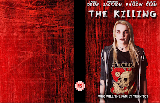
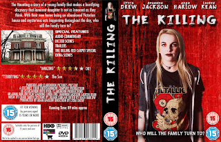
The first stage that I went through when making my DVD sleeve was to make the canvas the same size as an actual DVD sleeve. I used the same background which I used on my film poster as I did on this DVD sleeve. So I added a front, spine and back to it.


With having the background which I wanted, I started to use some of the things that I already had on my film poster as they are both the same product. I used the image which I had already taken for my film poster for my DVD sleeve. I also used the same title of the film, tagline and names of people in the film so you can see how the poster and DVD sleeve link together. I went on to adding the BBFC logo onto the spine.


The next stage I went through adding the title onto the spine, a company logo which I created myself and the rated 15 logos on to the front cover and the spine. Everything which is on my DVD sleeve is all on different layers so that I can move everything separately without everything else moving with it. With the box on the back cover with the bbfc sign and text in it I had to group them all together so that I could move them as a group instead of having to move each thing on its own.
After finishing the front cover and the spine, I went onto starting to add things to the back cover. I used the blurb which I had written in my proposal to add onto the back of my DVD sleeve and scaling it to the correct size. I also used the move tool to help get it into the correct place. I next added text with the special features which will be in the film and an image of a old house. I added the image of the old house onto the back cover as this is where the film is mostly based/filmed. The credit bar was another thing that I copied from my film poster to put onto my

DVD sleeve as this is what DVD sleeves have.


The final stage that I went through was adding star ratings as this is what DVD sleeves I looked at have. I added a barcode, the running time of the film, another bbfc box logo and other company logos/sponsorship logo. I added these things onto it as on DVD sleeves that I evaluated theses things were also on it. So by adding these it will make it look professional. Throughout the making of my DVD sleeve I scaled most of the items that I have on each side. I also used the
move tool to get everything in the place.


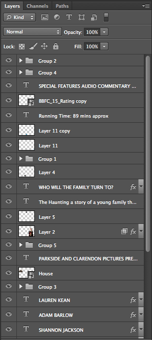
This is a screenshot showing how everything is made so it will be on its own layer. I also grouped quite a lot of things together such as the star rating with who it came from and what they think of it. I thought to group these things so that I don't have to keep moving everything on their own and will be able to move them in a group.