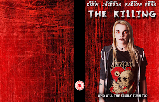
Throughout the process of making my DVD sleeve, I took screenshots of the stages that I went through.

The first stage that I went through when making my DVD sleeve was to make the canvas the same size as an actual DVD sleeve. I used the same background which I used on my film poster as I did on this DVD sleeve. So I added a front, spine and back to it.
With having the background which I wanted, I started to use some of the things that I already had on my film poster as they are both the same product. I used the image which I had already taken for my film poster for my DVD sleeve. I also used the same title of the film, tagline and names of people in the film so you can see how the poster and DVD sleeve link together. I went on to adding the BBFC logo onto the spine.
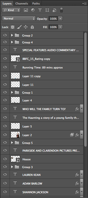
The next stage I went through adding the title onto the spine, a company logo which I created myself and the rated 15 logos on to the front cover and the spine. Everything which is on my DVD sleeve is all on different layers so that I can move everything separately without everything else moving with it. With the box on the back cover with the bbfc sign and text in it I had to group them all together so that I could move them as a group instead of having to move each thing on its own.
After finishing the front cover and the spine, I went onto starting to add things to the back cover. I used the blurb which I had written in my proposal to add onto the back of my DVD sleeve and scaling it to the correct size. I also used the move tool to help get it into the correct place. I next added text with the special features which will be in the film and an image of a old house. I added the image of the old house onto the back cover as this is where the film is mostly based/filmed. The credit bar was another thing that I copied from my film poster to put onto my

DVD sleeve as this is what DVD sleeves have.
The final stage that I went through was adding star ratings as this is what DVD sleeves I looked at have. I added a barcode, the running time of the film, another bbfc box logo and other company logos/sponsorship logo. I added these things onto it as on DVD sleeves that I evaluated theses things were also on it. So by adding these it will make it look professional. Throughout the making of my DVD sleeve I scaled most of the items that I have on each side. I also used the
move tool to get everything in the place.
 This is a screenshot showing how everything is made so it will be on its own layer. I also grouped quite a lot of things together such as the star rating with who it came from and what they think of it. I thought to group these things so that I don't have to keep moving everything on their own and will be able to move them in a group.


No comments:
Post a Comment